An app to engage with the University of Illinois campus.
The University of Illinois came to Pixo with a campus engagement app. They were trying to accomplish a lot with this one product and the app needed to drive student engagement on campus in several different ways. However, as features were added confusion increased for users. I worked with a UX designer to simplify and reduce cognitive load.
Developing processes
The client team members had varying levels of experience and capabilities when it came to managing the app content. We also needed to fact-check content with stakeholders across the Unversity. For these reasons, I decided to rely on relatively low-tech tools to establish content management processes, mainly working in Google Suite.
A microcopy log
Maintained in a simple spreadsheet so it could be exported as a CSV file and quickly imported into the app. This also allowed for anyone to make updates easily.
A content template
Distributed to stakeholders across the university for efficient information gathering.
User research and usablity testing
The client team had desires and goals that seemed to conflict with those of the students. To fully advocate for the user, I conducted a series of interviews and usability tests with students. The insights and analysis that came out of those helped us prove a need for user flow and content updates.
Presenting to clients
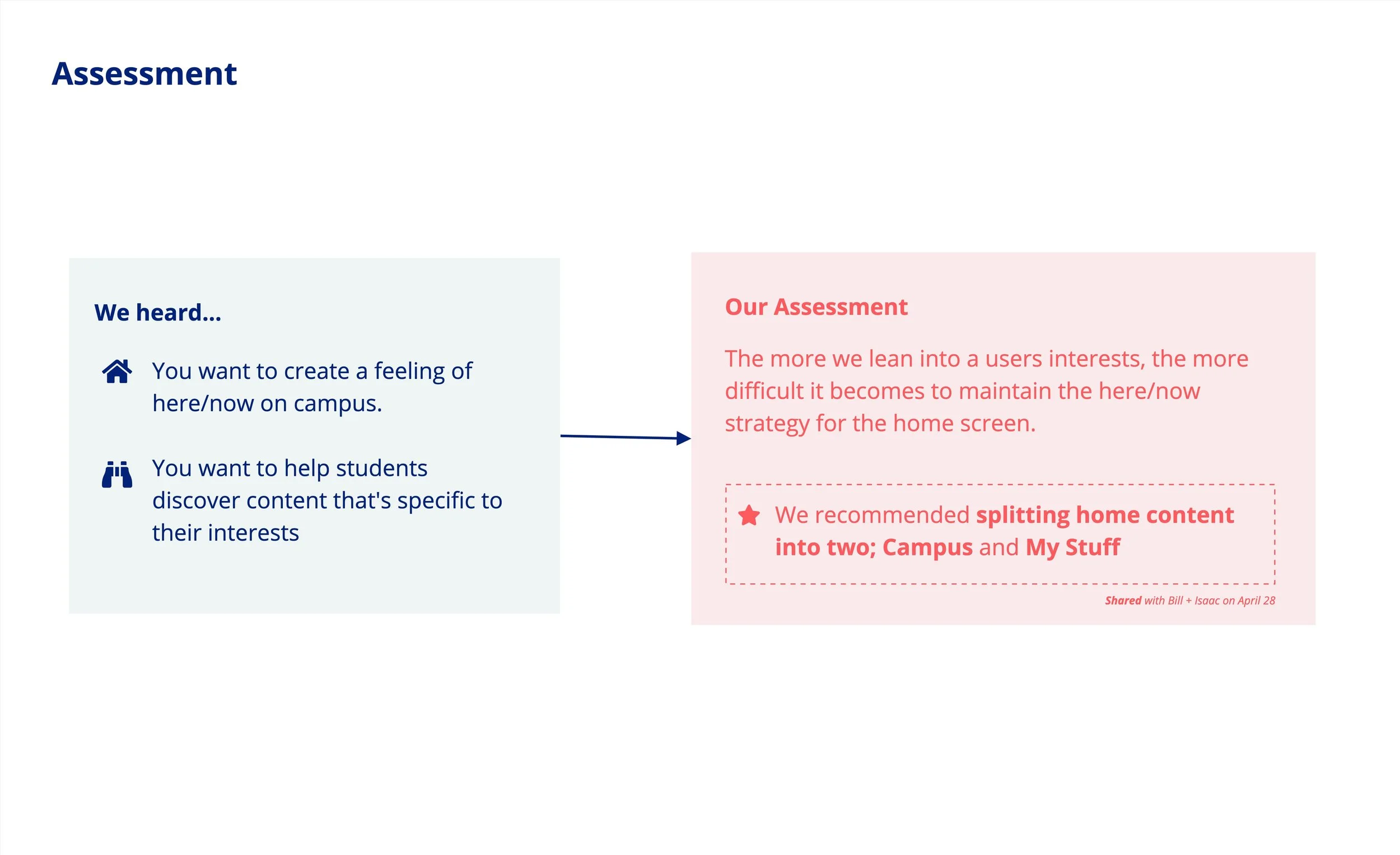
We drew clear connections between research findings and recommendations.
Recommendations
& implementation
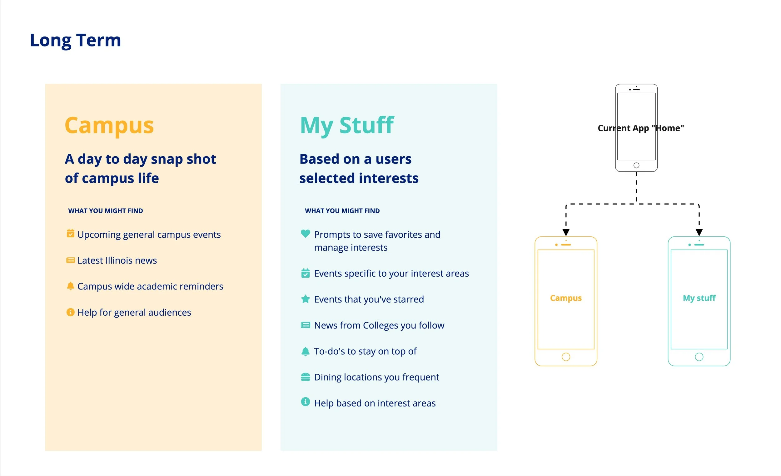
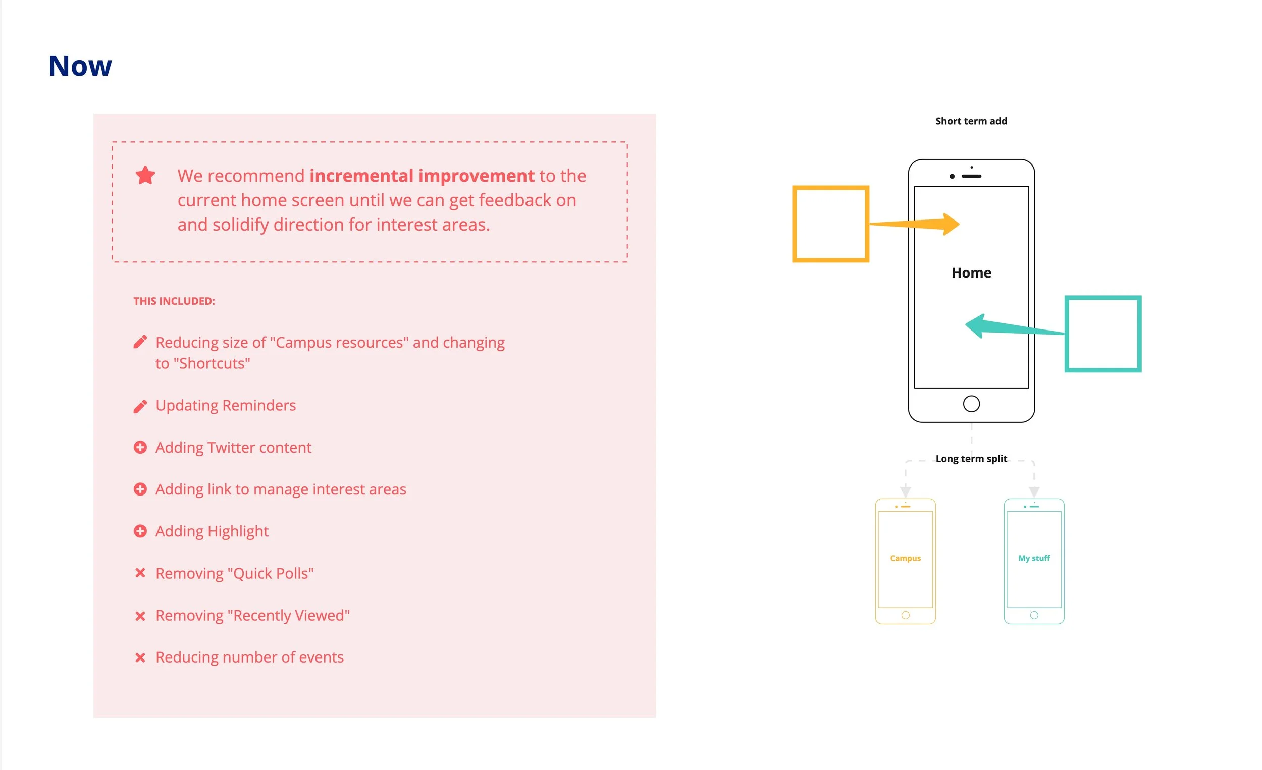
The outcome of making user-informed design and content decisions meant that some features and content were archived due to lack of interest. We were able to advocate for this with data. It was tough to get buy-in but archiving increased clarity for users. During usability testing, we saw increased task completion.
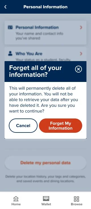
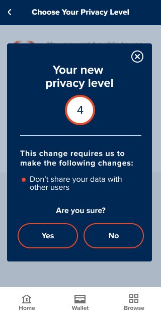
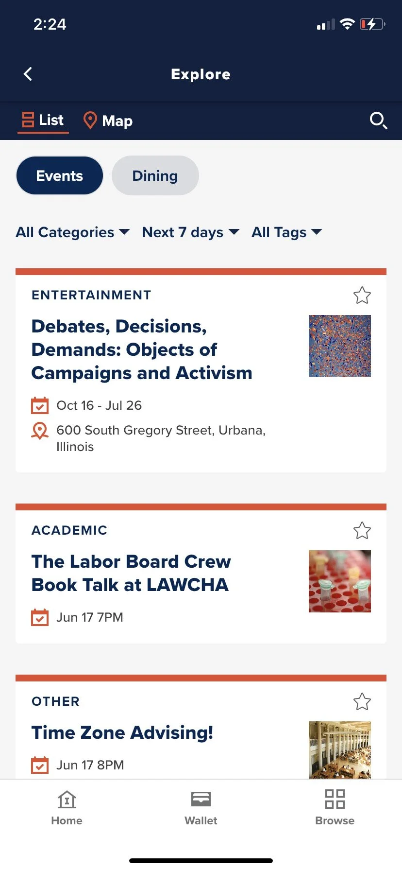
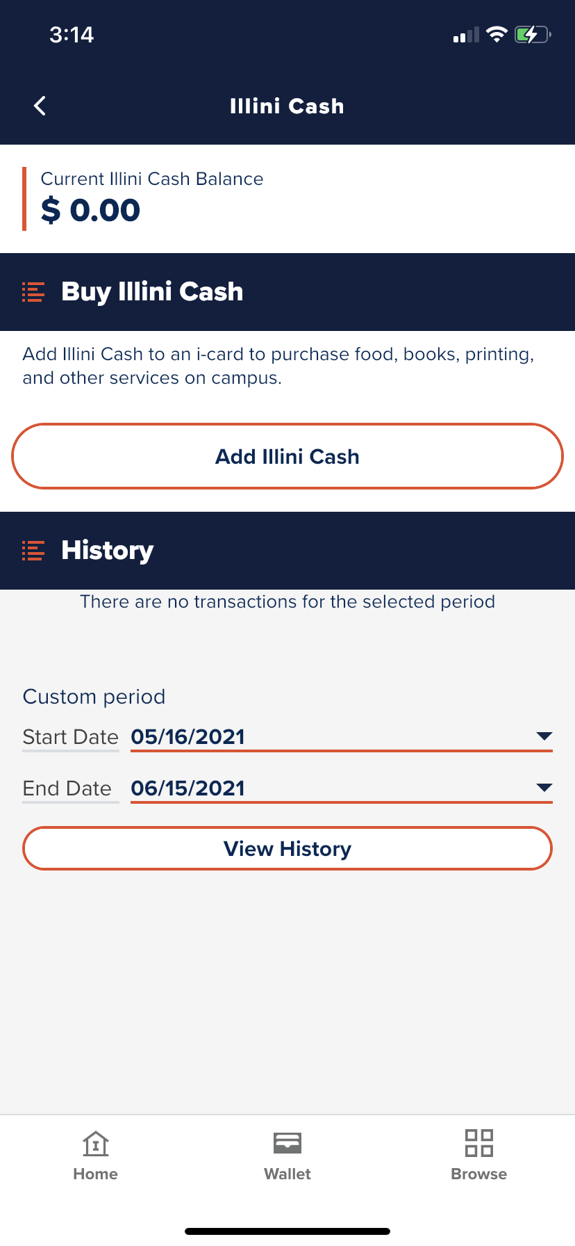
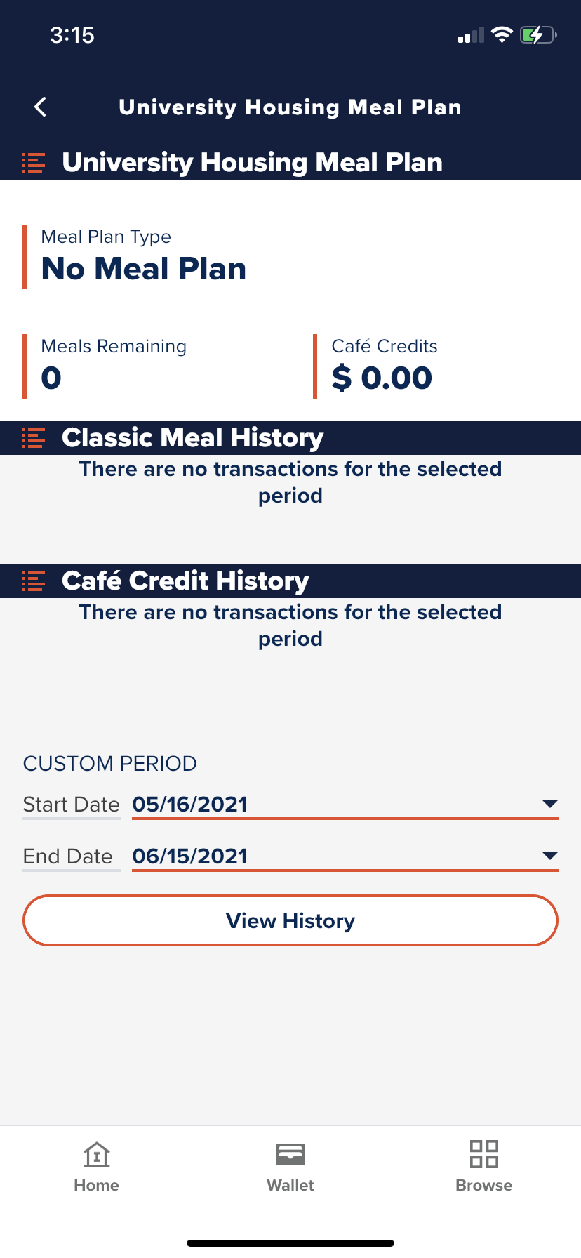
We improved the flow and organization of content on the app and rewrote copy to match user expectations. We also established consistency in language and terminology. The impact of this new flow and plain language can be seen most clearly on the privacy and security screens. We made a typically confusing set of approvals clear and transparent.
Of course, we also documented all our voice and tone suggestions in a style guide, so it an be maintained over time.


